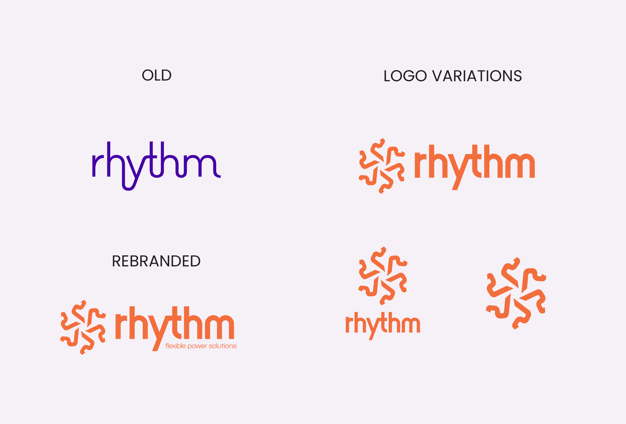
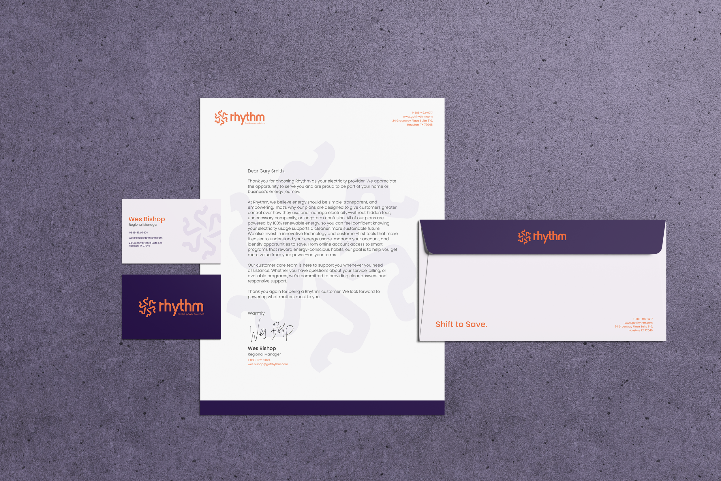
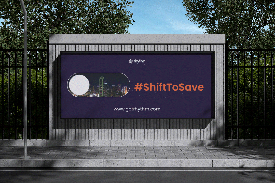
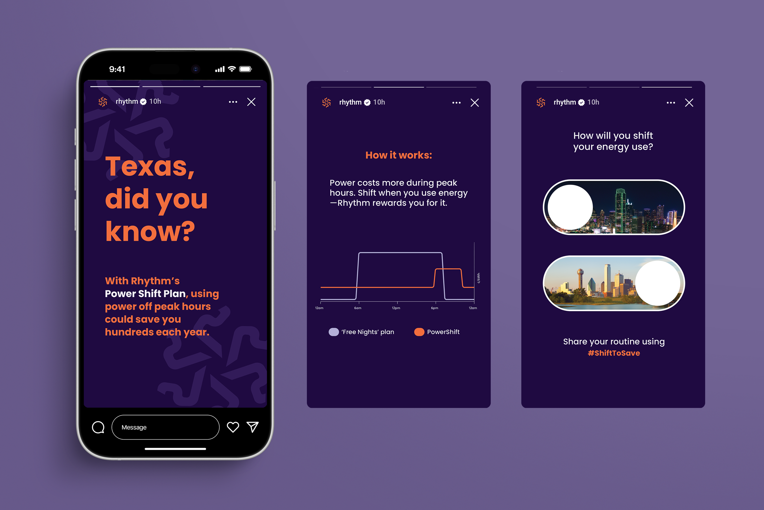
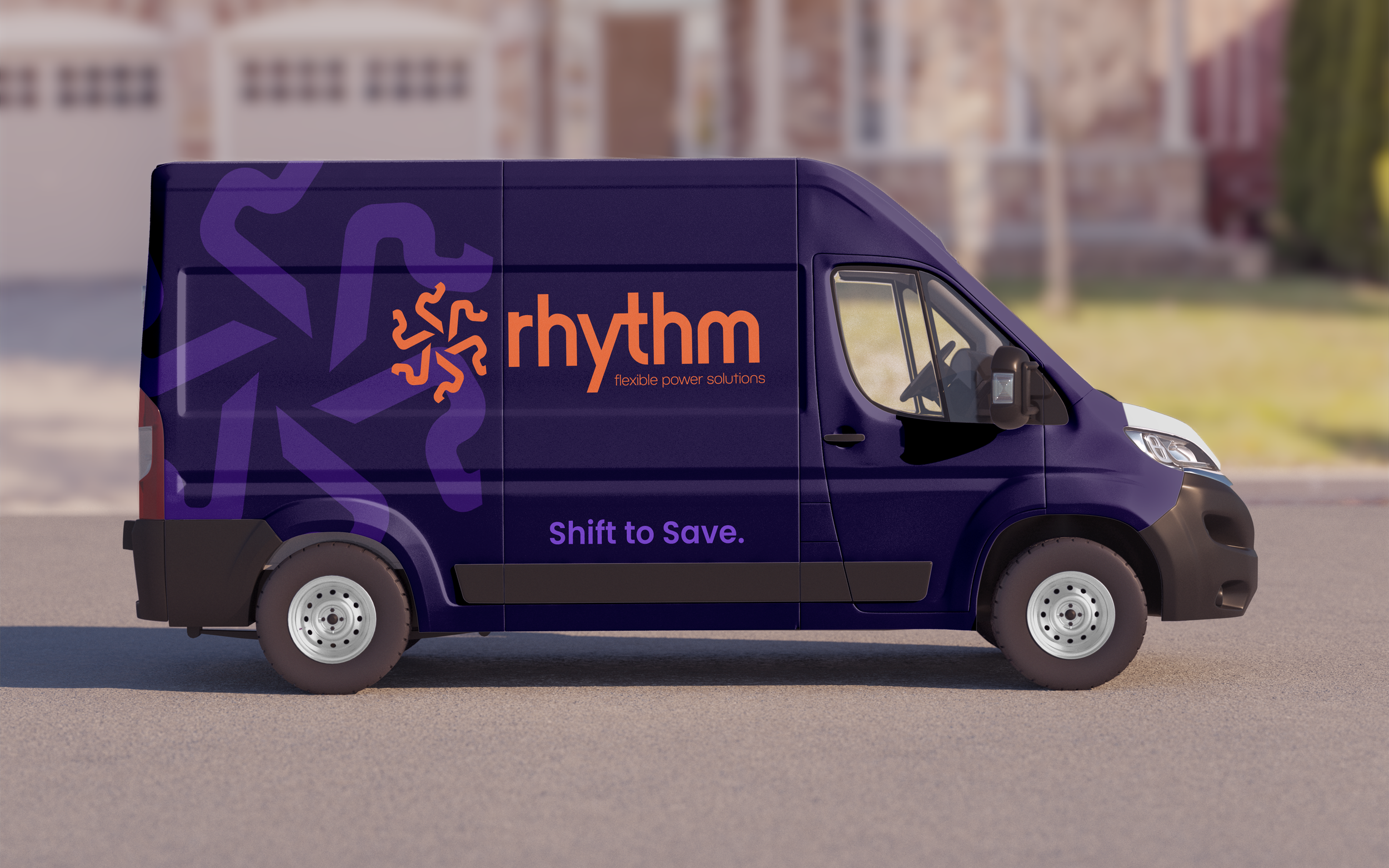
Rhythm is a renewable energy provider specializing in time-of-use plans that reward customers for shifting their energy consumption to low-demand hours. Despite their innovative mission, the original brand identity suffered from a significant conceptual gap. Research and interviews revealed that the name "Rhythm," paired with the previous logo mark, led many to mistake the company for a music streaming service rather than a utility provider. To bridge this disconnect, my rebrand introduces a strategic orange accent to the brand’s existing purple palette. While the purple maintains brand recognition, the infusion of orange injects much-needed warmth and vitality, immediately signaling thermal energy and light. The new logo mark features a sophisticated cycle motif, representing energy moving through time, paired with an abstract sun to ground the company in its renewable focus. This evolution transforms Rhythm from an ambiguous tech brand into a clear, energetic leader in the sustainable power sector.
Rhythm Rebrand
Rebranding Identity
Spring 2026
Illustrator, Photoshop, InDesign, After Effects