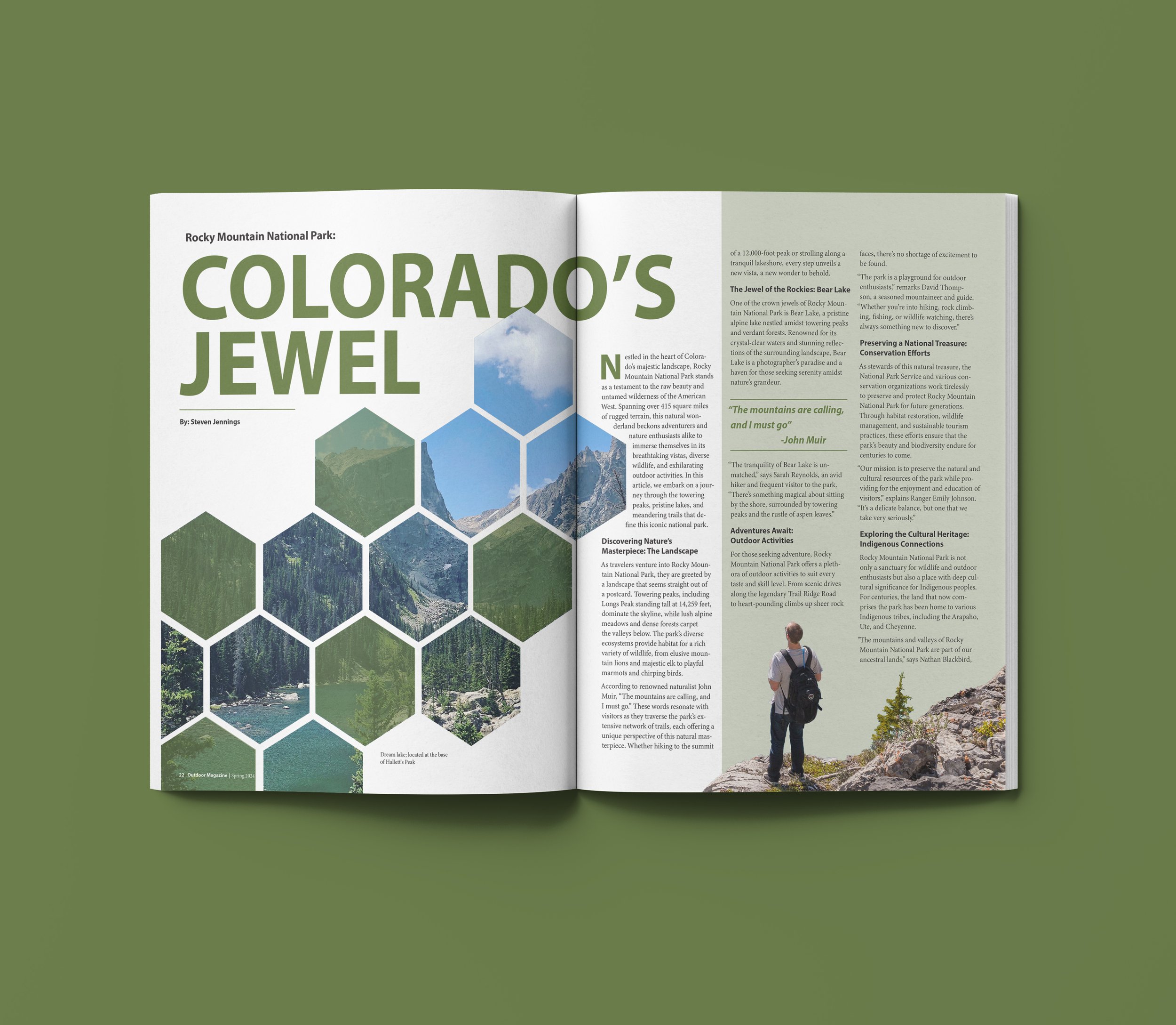
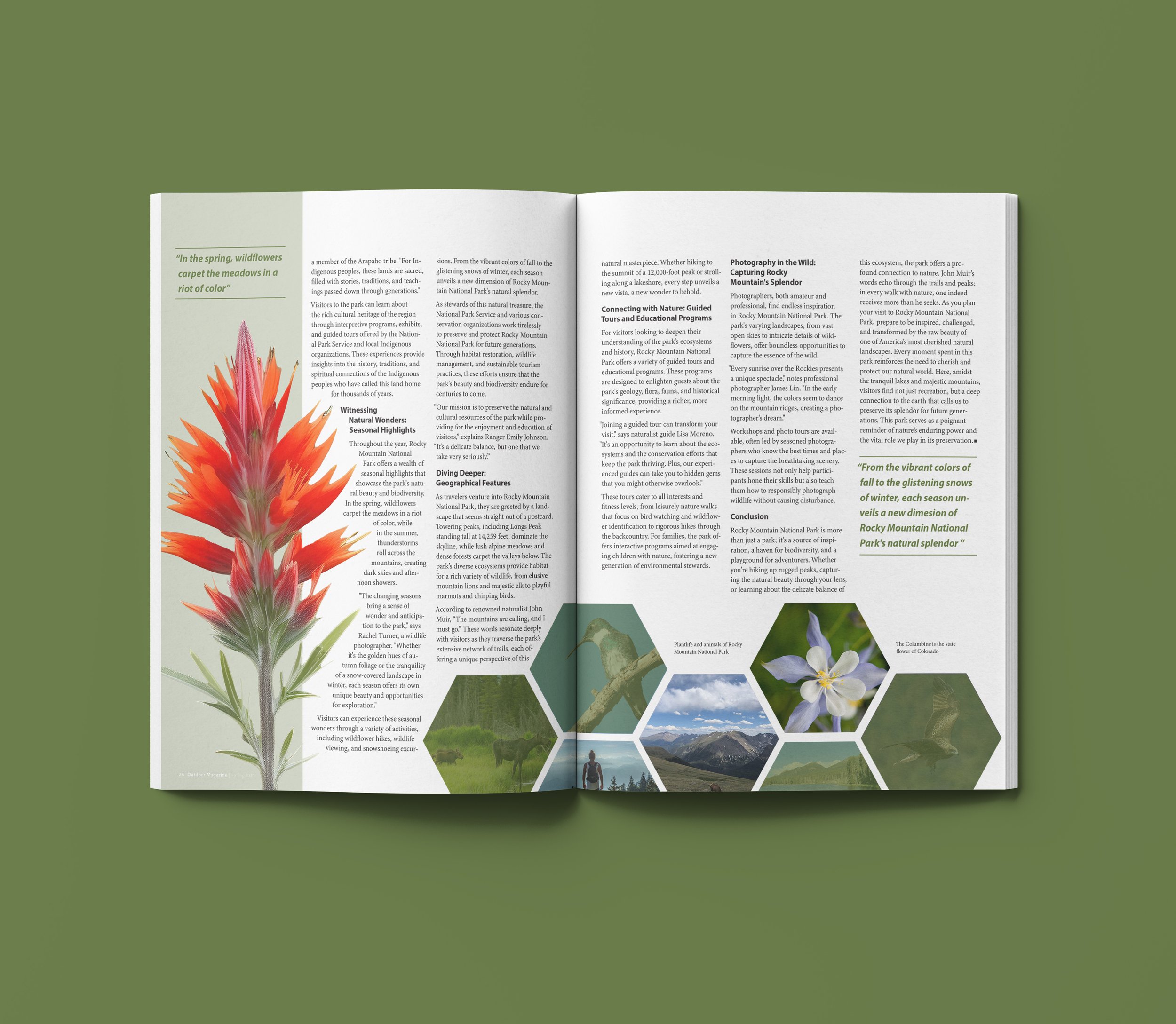
Inspired by the serene beauty of Rocky Mountain National Park, this two-spread feature article was designed for a nature magazine to evoke the quiet majesty of the outdoors. The layout blends stock imagery with original photography—including the headline image, the central hexagon on the second spread, and a lake photo that bleeds off the page—bringing a personal and immersive touch to the piece. Design principles such as repetition, proximity, and hierarchy establish visual consistency across both spreads. Repeated use of hexagon frames, green overlays, rectangular bars, and dividing lines helps to unify the composition while subtly guiding the reader’s eye. These hexagonal elements, inspired by naturally-occurring patterns, reinforce the organic theme. Imagery flows across columns and spreads, gently disrupting the grid to reflect the untamed essence of the landscape. Two complementary type families, used with variation, create a clear typographic hierarchy and distinction between sections, contributing to a balanced and cohesive editorial design.
Colorado’s Jewel
PUBLICATION LAYOUT
2024
INDESIGN